Wizard Posted June 7, 2004 Posted June 7, 2004 (edited) Note: It's sad that SNKPlaymore Japan is releasing the site now after many months of leaked photos. Well here is the full High Resolution(cropped) for everyone's view pleasure Portraits (All characters execpt Geese) Screenies Example Portaits: Example Screenshot: Whose with me? Worst/Worse KOF rehash? Art is funky and screenies are bleh. Edit: Neowave site has been updated with ALL characters(execpt Geese) Edited June 8, 2004 by K`dash
Agozer Posted June 7, 2004 Posted June 7, 2004 (edited) What the hell? The screens look just marginally above of what the Neo-Geo could pull off. EDIT: Sure, the backgrounds are pretty but the character sprites are just like you said. Edited June 7, 2004 by Agozer
BuRRdRinkA Posted June 7, 2004 Posted June 7, 2004 (edited) Looks the same other than the backgrounds. I'm not that impressed at a glance.... Edited June 8, 2004 by BuRRdRinkA
Gryph Posted June 7, 2004 Posted June 7, 2004 I'm with you K'dash, this is the worst re-hash of KOF. I mean, Kim isn't even in it. But the selection screen looks cool.
BoomBa_GoosE Posted June 7, 2004 Posted June 7, 2004 yes i agree with u fellas...ugly neogeo rahash. backgrounds, i can care less really...i mean if MVC2 didnt have those 3d backgrounds i wouldnt have mind either. art is kinda tacky...it looks very american based drawing. umm yeah, i believe the selection screen looks pretty neat too...but if thats the only thing to look forward to, i rather put all my excitement into maximum impact... good stuff k'dasH~!
Gryph Posted June 7, 2004 Posted June 7, 2004 (edited) You know...they should have atleast updated the move effects (fire, lightning, energy ball, ice) to make those look uber cool. From these pics it doesn't look like they've done that. Edited June 7, 2004 by GryphonKlaw
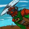
Wizard Posted June 7, 2004 Author Posted June 7, 2004 The character is art funky (is it just me and my dirty mind or did Mature's bust size increase?). Theres some favorites, but most of the male art is bleh to meh.
Gryph Posted June 7, 2004 Posted June 7, 2004 The character is art funky (is it just me and my dirty mind or did Mature's bust size increase?). Theres some favorites, but most of the male art is bleh to meh.The females' eyes are much better this time around. But I like the way Saisyu looks in his artwork.
Diso Posted June 7, 2004 Posted June 7, 2004 Wha. Looks pretty Ewwy. The screenshot u put up suck. BUt the ones you put in that link are way better Artwork is nice
DoubleDragon Posted June 8, 2004 Posted June 8, 2004 LOL this game is looking more and more like a kof test for the atomiswave hardware. It looks like all they really did was make newer backgrounds but all the kof sprites are the same. Also just new portraits as well. I think SNK was anxious to make something for sammys hardware so they are trying to throw something together and see how it'll turn out. SNK is also working on maximum impact so that also may be why the Neowave game is looking so basic.
Wizard Posted June 8, 2004 Author Posted June 8, 2004 To get things straight with everyone. Development: Sammy, Noise Factory & SNKPlaymorePublishing: Sammy & SNKPlaymoreMusic & practically everything else: Noise Factory
Gryph Posted June 8, 2004 Posted June 8, 2004 (edited) Development: Sammy, Noise Factory & SNKPlaymoreHmm...that doesn't clear anything up. So all three companies are developing the game? What is included in "everything else" which isn't development and publishing? That's all game making is, development and publishing. Now we can't pin the blame on one company, instead we must distribute our displeasure and hate of the game on all three. Edited June 8, 2004 by GryphonKlaw
smoke Posted June 8, 2004 Posted June 8, 2004 And I was thinking it would be KOF with double the resolution and better special effects.
Gryph Posted June 8, 2004 Posted June 8, 2004 And I was thinking it would be KOF with double the resolution and better special effects.I'm just hoping that SNKP are going to do that for KOF2004. Ofcourse that's wishful thinking and probably won't happen for another few years.
Wizard Posted June 8, 2004 Author Posted June 8, 2004 Am I the only one who thinks GG's graphics suck?

Recommended Posts
Create an account or sign in to comment
You need to be a member in order to leave a comment
Create an account
Sign up for a new account in our community. It's easy!
Register a new accountSign in
Already have an account? Sign in here.
Sign In Now